

VeVe Design System
Joining VeVe, I was faced with a challenge to turn a rapidly evolving digital collectibles platform into a seamless, intuitive experience for millions of users. I embraced this challenge by leading the planning, refinement, and delivery of VeVe’s inaugural design system.
VeVe’s core values were the compass that directed decision making. They anchored us to the ‘why’ behind our pursuit: to empower collectors and elevate their experience. This ‘why’ fuelled our mission to redefine how we delivered products in Design.
Our collectors, the heart of VeVe, were our ultimate inspiration. Their needs drove us to enhance the brand’s visual presence and build tools that accelerated the introduction of new features. We weren't just creating a design system; we were building a foundation for more engaging and efficient user journeys.
This achievement was a testament to the power of collaborative design. As a Design Practice, we thrived on the unique contributions of each team member, recognising that collective expertise was essential to realising this ambitious goal.
VeVe’s Design System principles
Goals
VeVe were growing, adding new verticals including Comics, and a metaverse, and had the need to unify these experiences. This alignment needed to be supported visually, functionally, and in a way that would support rapid growth, experimentation, and flexibility.
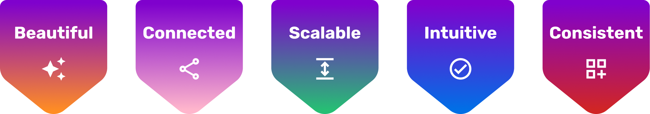
We had the ambition to build beautiful, connected, scalable, intuitive, and consistent experiences. To do this I led the initiative to deliver a Design System that would support business, brand, and user needs. These needs included:
Reduce operating costs
Create efficiencies
Grow our audience
Unify VeVe’s products
Increase site traffic
Build social engagement
Provide consistency
Humanise our approach
Make it easy for the user
Approach
I worked with stakeholders and talked with users to understand the requirements of the work to be done and assessed the needs of the teams in Design, Technology, and Product. Using these insights I developed a 5 phase plan to deliver the new Design System.
Phase 1: Define UI requirements with current and future states in mind. Work with Engineering to set up frameworks and repositories. Set up and run Steer Co to align on needs and progress.
Phase 2: Create and document styles, variables, and tokens. Build foundational components. Design page templates and test components.
Phase 3: 1:1 mapping of new components to existing experience. Small UX enhancements delivered alongside UI. User comms, and initial delivery in production.
Phase 4: Broader UX changes introduced including IA update. Refinement based on production feedback. Documentation.
Phase 5: Innovation and evolution. Ongoing maintenance and contribution model developed.

Example of a composite card component designed to work in multiple use cases
Solution
The system is built with a focus on flexibility and adaptability, while also delivering to the expectations we have of our brand to deliver great user experiences. Foundations in Figma included variables, styles, and tokens which allowed us to create base components including buttons, icons, switches, and everything needed to build the experience. These were defined in the system with the ability to add variants to augment the existing sets. These were combined into composite components like cards modals, pricing modules, and more. This set formed the basis for all page templates to be created, and patterns to be defined across all verticals.
Working with front end developers, architects, and engineers, we ensured that the assets created were connected to code and could be leveraged in our products efficiently. Performance was also considered with decisions being made to improve the UX alongside the UI.
Deliverables
Concept validation and exploration connecting with business, brand, and user needs
Set up and running of a Steer Co to ensure clear internal communication and consultation throughout the delivery process
Engagement with internal teams including exec, product, engineering, architecture, and design
Creation of System assets including foundations, components, templates, patterns, and guidelines
Themes to help users reflect their personal choices for UI appearance with light and dark mode
Phased delivery of the system across an existing experience managing the transition from V1 to the new experience
Building blocks: How the system builds from atoms to organisms.

Outcomes
The Design team has been able to significantly improving design team efficiency and consistency; reducing concepting, prototyping, and delivery time by over 69%. High fidelity mockups can be quickly created to explore concepts and validate ideas.
Developers are able to share a common language when building experiences. Tokens, naming conventions, and pre-built components with defined variables have helped to reduce time spent in user acceptance testing and removed the need to refactor individual assets across the site. Small updates using a React framework can be made to quickly evolve experiences in production environments.
The visual language has been modernised to reflect user expectations, and provide themes to allow personalisation. Trust has been increased through consistency and best practice approaches in UI and UX.
Learnings
A Design System is not a set and forget toolkit for the team. It needs to be actively maintained and evolved to ensure developing needs are able to be supported.
A Design System is not something built by designers for designers - it’s a tool which should be developed by everyone who contributes to product experiences.
Simplicity is your friend, reduce complexity and consider the purpose of the assets being created. Too many variants can reduce consistency and make it hard to choose the right component.